
Website Design for the Nonprofit Homepage: Problem, Solution, Impact
As noted in the previous blog post, Website Design for a Winning Homepage, according to sweor.com it takes about 50 milliseconds -- that’s 0.05 seconds! -- for users to form an opinion about your website that determines whether they like your site or not. For nonprofit organizations, that doesn’t leave much time to explain your cause before going for the big ask: to get involved and donate.
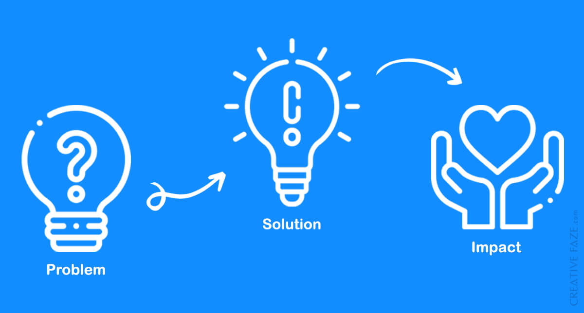
So you’ll want to highlight some key information – namely the problem, your solution and your impact – to your potential donors in a clear and concise way. With 0.05 seconds to do so, it may just be a good idea to have all that key information (yes, all of it) right on the homepage. Can it be done? With a little bit of planning and website design strategy, it sure can.
Check out these two examples of nonprofit website homepages that efficiently use that important homepage real estate, bringing key information to the forefront.
2 Examples of Nonprofit Websites with Efficient Homepage Design:
1. Charity: Water
On a mission to bring clean and safe drinking water to people in developing countries, Charity: Water wastes no time (i.e. homepage space!) on presenting the problem, solution and impact. This information is made evident in the first 3 blocks of their homepage, all in a matter of a few concise sentences.

The problem: In bolded font, the nonprofit states the problem in a single sentence: 1 in 10 people lack access to clean water.
The solution: The next two sentences (We’re on a mission to change that. Here’s how.) naturally lead the audience into their solution, which is summarized into brief descriptions of their 3 initiatives, each accompanied by an icon.
The impact: Tangible data illustrates the nonprofit’s impact.
2. Covenant House
Covenant House is the largest agency in Canada serving youth who are homeless, trafficked or at risk. Using the titles “The problem” and “Our solution” on the homepage, the website presents the information loud and clear. Real life stories illustrate the impact that Covenant House has had on some of the young people they have worked with.

Note that the problem, solution and impact make up the very web pages of the Covenant House website and so finding this information is easy no matter where you are on the website (as the labels are contained in the header’s navigation menu).

Are you a nonprofit organization who uses this format on your website? Which nonprofit websites have left a lasting impression on you?
Need website design services? Contact us and let's get the conversation started.


Get the partner you've been waiting for.
Have a new project coming through the pipeline?
Tell us all about it and we’ll show you why we’re the right choice.